Every photographer seems to have their own way of converting their digital photographs into black & white depending on their style. I write this tutorial as a way to offer you just one way of doing it, certainly not the only way or the right way. I should also say that I like my black & white photographs to be just that…black and white. I suppose you could call it “high key” which not everyone likes. High key means that the image is high contrast or even over-exposed. So if you don’t like that kind of image, you may want to tone things down, but don’t worry, I hope this tutorial will show you that it’s easy to adjust to your own taste. I have a number of different things that I do to create different effects in my images but this is what I do when I just want to keep it plain and simple.
These instructions should be straightforward enough for a novice photoshop user although it presumes you’ve used Photoshop before and know a few of the terms like Layers and Opacity. No filters are used, just basic settings that should be in all versions of Photoshop (although I’m not sure about Elements since I’ve never used it).
So, without anymore faff and disclaiming, fire up Photoshop and give this a go:

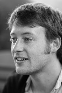
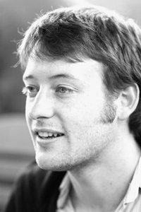
1. I’ve chosen this photograph of my baby brother Peter, mostly to cause him some embarrassment (hey bro!) but also because this is a portrait I think will look good in black & white…not all photographs do. Generally I like to choose images that already have some level of contrast between background and subject. Above is the image as it looks straight from my camera.
__________________________________________________________________
2. Now, the easiest method, and the way I did it when I first started out, would be to strip out the colour and just change the photo to Grayscale like I’ve done above. All well and good except grayscale is not black & white…it’s gray and that makes for a pretty flat image. So, I never use grayscale anymore (or desaturate since that gives a similar result).
__________________________________________________________________
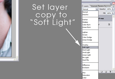
3. Instead, the first thing I do is I duplicate the original layer and I set the new layer to “Soft Light” as shown above. This gives the image a bit of a pop in contrast and I often use it in my colour photography too. If it seems a bit harsh, just tweak the opacity of the duplicate layer (you can see the opacity setting at the top right of the image above). I set mine at 50%:
__________________________________________________________________
4. Next, for a little more pop I create what’s called an adjustment levels layer over the top. You will find this under Layer>New Adjustment Layer>Levels (see above). Now you could just go to Image>Adjustments>Levels and tweak the levels that way, but with adjustment layers you can go back at any stage and tweak again or go back to the original. There are other benefits but that could be a whole different tutorial!
__________________________________________________________________
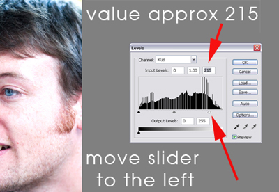
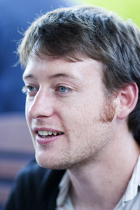
5. After creating the levels layer (click OK to the little info window that pops up) I pull the slider on the right slightly to the left as shown above. Not too much or it will start to look like pop art. Here’s the result:
__________________________________________________________________
6. Now we can finally move onto the black & white part. You could always skip the steps up until this if you don’t like that “High Key” effect I was talking about and you will still get a good black & white image.
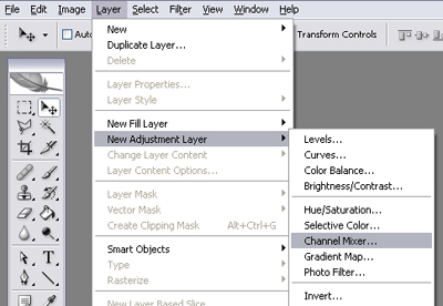
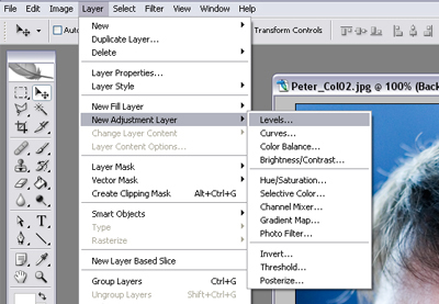
7. Create another adjustment layer…this time the Channel Mixer as shown above. Click OK to get to the options box.
__________________________________________________________________
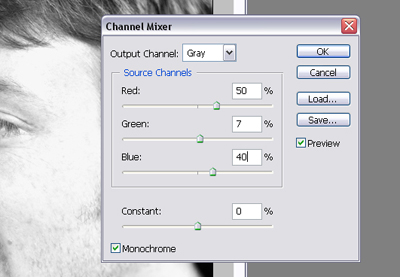
8. The Channel Mixer is like applying coloured filters to your lens. Red, Green and Blue filters all give very different results. I have the settings I use for a basic black & white image pictured above but have a play with the different colours and see what you come up with. Don’t forget to tick the Monochrome option at the bottom left! Result:
__________________________________________________________________
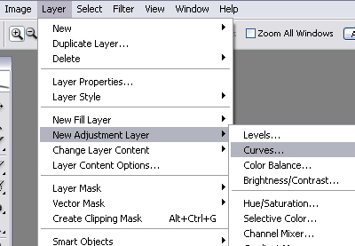
9. Once you’re finished tweaking, click OK…the result’s not bad, we could probably leave it there…but I like to push it a little bit more. So I create a final adjustment layer. This time I choose a Curves layer (see above) and click OK to get to the options.
__________________________________________________________________
10. You will be given a box with a graph and a straight diagonal line going through it. You can manipulate that line by clicking on it and then dragging the points. Click once near the bottom of the line and once towards the top and then pull the line so that it becomes a loose “S” curve as shown above. This is another layer I like to add to my colour images too as it really brings out the contrast in an image giving it a real pop. Once you’re happy, click OK…
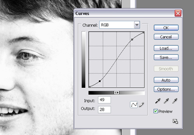
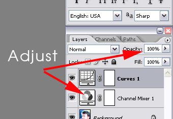
TaDaaa! And you’re done! Now the nice thing about the adjustment layers is that you are free to go back and tweak until you have an image that you are happy with. You can do this either by double clicking the icon on the left of the layer or by adjusting the opacity of the layer like I have shown in this image:
What you should have at the end is a nice clean Black & White image rather than a flat Grayscale image.
I hope I have written this in a way that wasn’t too complicated…please leave me a comment if you have any questions about what I have done or just to let me know what you think. Have fun!
15 replies on “Black & White Conversion In 10 Steps”
Claire,
Congratulations. When I realised what you were about to give me I fairly smiled with delight. I can’t wait for your book.
I’m so far back in the photo-chain that I’ve never used Photoshop. This will encourage me to get it and use it. So far, all I’ve done is take photos and reproduce them unadulterated.
As for your instructional technique, it’s as good as I’ve ever come across.
This is really, really cool! I learned loads from that, it seems like you’d need a degree to operate Photoshop! Show me more! Show me more!
Hi Claire. That’s a cool lesson on Photoshop and B&W. Well done.
Personal taste for me prefers the grayscale. I can see more facial details but admittedly I might have turned up the contrast a bit on the original to reduce the slight flatness you mention. It’s a subjective area I suppose and I’m open minded on any end effects. Maybe it’s also a case of how purist one is in defining B&W.
Omani: I think it would be a very short book but thanks for the compliment 😀
K8: I’m glad you liked it. I don’t think you need a degree but you do need a certain level of geekiness (thankfully I have plenty of that!).
John: I agree it’s completely subjective and not everyone likes this type of high-contrast shot. It wouldn’t have any place in news photography for instance. I’m not a purist at all although I know there are even formulas out there for getting exactly the same effect from digital as you would from the different kinds of black and white films!
[…] Entry: Black & White Conversion In 10 Steps Next […]
Claire, thank you so much for this!
Here’s the result of my very first attempt at doing a proper BW conversion (instead of just stripping the colour or using a gradient layer).
And I agree with Omani and K8, I want more! 🙂
By the way, I only have Elements 2.0, which doesn’t have the channel mixer or curves. But Earthbound Light have created a great solution. The only thing is that you can’t go back and adjust the layer once you’ve clicked OK, so you have to create a new one every time you want to make a change.
Siobh, I am so happy that you found it helpful and you got a great result with it! Your eyes look amazing.
Thanks for the information on Elements, I have a copy somewhere but wasn’t sure what it had stripped out so thanks for that link. I’m surprised it doesn’t have curves and I’d be lost without Actions!
Thank you, you’re sweet! ^_^
I’ve just found this guide by Richard Lynch, which explains how to run actions in Elements! I might give it a try…
Do you have any control over the settings when you’re playing an action, or would that sort of defeat the purpose? But I’m guessing you can access the layers as normal when the action has run through, and make minor edits that way?
Yes, exactly, everything is tweakable (if that’s a word :D) once the actions have run because I do it with layers. I also have actions which run the seperate parts alone so I can mix and match for different results.
Isn’t it Bill Brandt’s work your high contrast reminds me of?
Wow, if only I could claim a tiny portion of his talents. Thank you very much for the comparison though!
Thank you very much for this excellent little tutorial! It’s exactly the thing I’ve been looking for and will be very useful as my foray into the digital photography world continues… Thanks!
[…] I’ve always had a fondness for black & white photos.I’d never tire of looking at them on any walls or albums.B&W photos can be absolutely stunning.I’ve been experimenting with black and white ArcSoft Photoshop conversion recently.I like it very much as it only requires less time & very li’l effort (ideal for a busy mami like me lol) by just selecting the grayscale mode in Photoshop.I know, I still have to improve the low resulting quality of the photos by probably following these useful steps! […]
Just wanted to say thanks for these tips! Ive been meaning to learn B&W conversion other than the notsogreat “desaturate” and this was perfect! I linked to you in my feeble attempt! I know its very different to yours, but its better than my usual ones! 🙂 Thanks!
Stumbling upon your blog is like stumbling upon a pot of gold! Your way of showing us tricks and tips is THE best I have discovered! Thank you a million times over! You are a delight!